
Optimizing Employee Performance Plan application
Reducing support tickets by 54% for an internal application with over 4,000 users

Overview
Employee Performance Plans are an annually recurring HR action for just under 5,000 employees. Our goal was to deliver a new Performance Plan Application that improved the user experience and decreased support tickets. I partnered with the team to:
Train the development team on how to plan, conduct, and analyze a usability test.
Establish a reusable framework to assess severity and significance of results to help the Product Manager prioritize and gain approval for additional, impactful work.
Support solution design to accelerate improvements and grow design skills within the team.
Challenge
The previous version of the performance plan application frustrated and confused users, caused a large increase in support tickets, and received pointed leadership criticism. Addressing usability issues with a new application was key to ensuring process compliance and reducing costs.
Users need a simplified performance plan actions to reduce confusion and ensure compliance.
The business needs to utilize out of the box functionality of ServiceNow to reduce support and maintenance costs, and expand UX capability with internal development teams.
Goals
Conduct usability testing and incorporate feasible results to reduce support costs
Provide usability testing training to the HR team, enabling them to conduct future testing independently
Provide a useful prioritization framework to evaluate potential improvements with limited resources and gain executive buy-in
Use the results and impact of this work as a case study to grow buy in on UX efforts in solution development and secure additional UX resources
Role
Solution Development Lead UX Researcher Designer & Consultant
ServiceNow Application, HTML, CSS
Technology
Usability Testing, Prioritization Framework, UX Training and Resources, Promotion of Results, Contractor Management
Responsibilities
HR Federal Team: Application Product Owner, HR IT System Owner, HR IT Executive
HR Contract Team: Business Analyst, Customer Support Lead, Service Now Developers (2)
Solutions Development Team: UX Designer (Contractor), Solution Architect, Solutions Executive Leader
Stakeholders
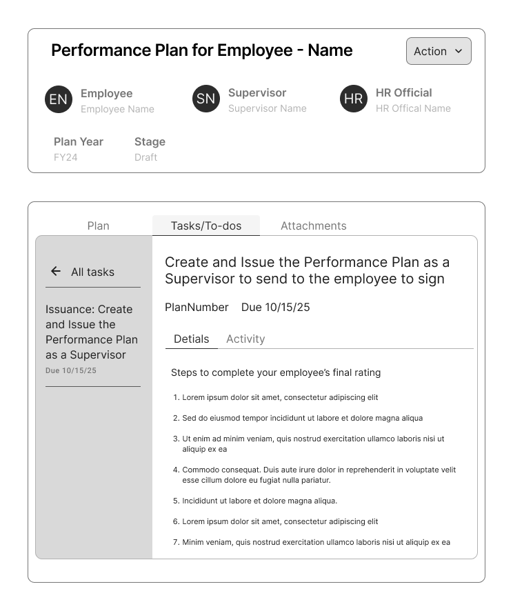
Recreation of the Instructions page that caused a lot of users issues because it was separate from there users completed actions.
Usability Test Overview
Key Research Questions
Intuitiveness: How intuitive are available processes for employees, supervisors, and reviewing officials?
Enough Guidance: Is there enough timely guidance to complete key workflows without assistance or training?
Content Clarity: Does the app use plain language and basic design patterns in a consistent and useful way?
Ease of Use: Does this new version of the app provide a better user experience than the existing version?
Participant Success Results By Task
-
Plan Creation: A new fiscal year has just begun, for your employee create a new performance plan for the year and issue it for them to review.
5 participants were given this task.
All 5 participants did not successfully complete this task on their first try. All needed a second attempt and receive help from the moderator.
-
Change in Position:
5 participants were given this task.
1 participant completed this task on their first attempt. 3 completed it on their second attempt with help. 1 could not complete the task.
-
8 participants completed this task.
5 completed this task on their first attempt. 2 completed this task on their second attempt with help from the moderator. 1 could not complete this task.
I structured this usability test to provided clear, prioritized results, alleviating the feeling that UX improvements must be “All or Nothing.” This framework clearly defined tradeoffs and allowed the Product Owner to make informed implementation decisions that benefitted users most.
Impact
Using a low cost methodology and investing in meaningful collaboration, this work produced massive results:
54%
reduction in support tickets during the “Plan Creation Phase” post-launch
10
of 12 usability issues addressed partially or fully by launch, with the other 2 addressed in training
5
HR Team Members trained in usability testing and basic design principles
1000+
audience members at organization-wide Lunch & Learn about this case study
Early data for mid-cycle reviews showed a 76% reduction in support tickets compared to the prior year. Usability testing was scoped into the next phase of work by the HR team to be completed independently.
My leadership was very pleased with the collaboration effort and the role I played in the noticeable app improvement. Because of this, I received additional funding and support to continue growing UX solution development services.
What I Learned From This Project
-
The choice to make this an immersive project, rather than a quick study I did myself, is one of the best decisions I made. For the HR development team, the experiential learning shifted the way they approached development and prepared them to build better apps in the future, not just improve this one.
For me, this was also time with my customer. I learned where development teams were in their UX maturity and how they perceived UX. Based on this project, I crafted and implemented an action plan to scale UX across the software development organization and shift the way apps were built from done to done well.
-
This project took more time than expected with collaboration slowing after the study before launch. We hit a 2-month lull in progress as the development team focused on other portions of the app. Leveraging the relationships and strong, shared understanding of the results built during testing helped us pick up work quickly and get results delivered. Everyone benefitted from the better app and large reduction in support tickets.
-
The severity framework from this study was incredibly helpful and helped gain leadership buy in to implement our results. Because of this, I standardized our definitions of Critical, Serious and Minor to be specific for enterprise software applications. I then implemented this standardized framework into all research projects and established an internal tracker to show issues across applications. This allowed us to identify repetitive or software-specific issues. I could then use issue frequency metrics as a key performance indicator (KPI) for UX work with the goal of reducing critical issues and improving out of the box functionality over time.